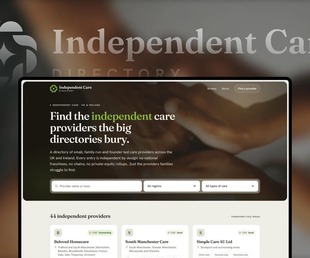
Brand & landing page · Concept
Azura Frames
Brand and landing page for a window frame price comparison service.
The brief
A client came with a sketch, a handful of reference sites and one instruction in capitals: no pre-made templates. The service compares window frame quotes for the Dutch market. A homeowner enters an address and gets up to four offers from local installers.
The real problem is not layout. It is that a stranger has to give up their address before they get anything back. Everything on the page has to earn that.
A window that is also an A
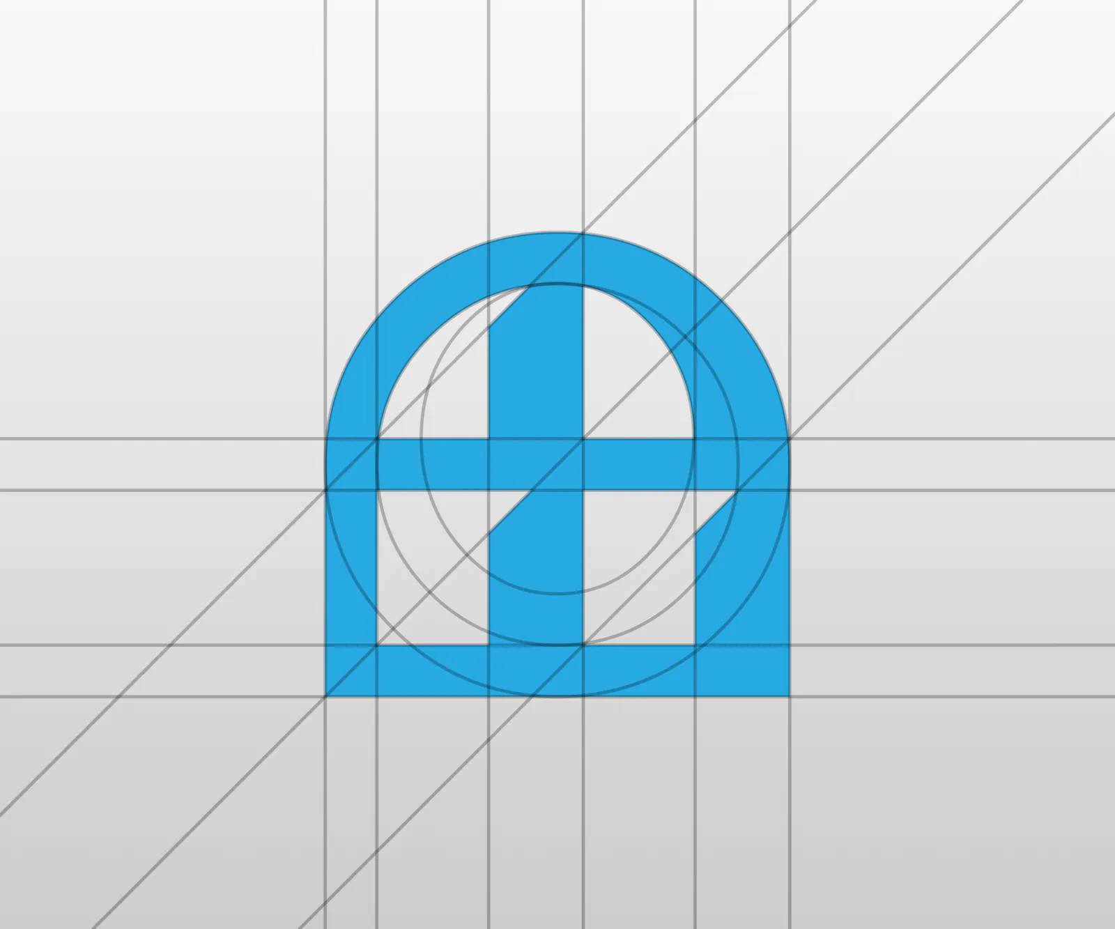
The mark is an arched casement whose mullion and transom form the A of Azura. Product and initial in one shape, and it still reads when shrunk to a favicon, which matters for a service people meet in a browser tab full of comparison sites.
One confident blue, warm interior photography, and no reach for luxury. This is a considered purchase, not an aspirational one.
The form is the product
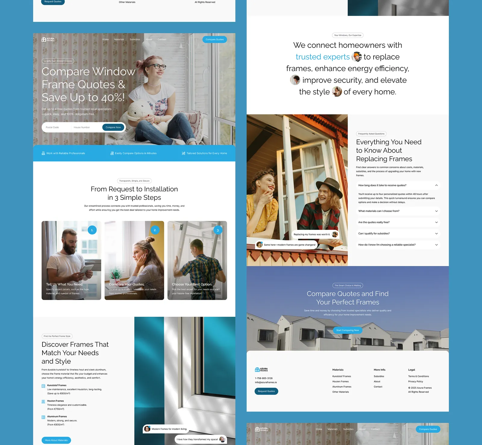
The quote request sits in the hero rather than behind a button, and asks for two things: postcode and house number. No name, no email, no phone. The less it asks for up front, the less it feels like a trap.
Everything below works on the same suspicion. Three steps from request to installation. A section on subsidies, which for this kind of work is often what decides whether a homeowner goes ahead at all. And an FAQ that answers “are the quotes really free” and “how do I know the specialist is reliable” in the reader’s own words.