Brand & landing page · Concept
Arcadia Estate
Brand and landing page for a Dublin property firm that buys, develops and rents across the city.
The idea
Arcadia Estate buys, develops and rents property across Dublin, residential and commercial. The brand and the landing page were a proposal for a design contest that didn't go anywhere.
What a property firm's site has to solve is credibility before charm. Someone landing on it is about to hand over a large sum, or a building they already own. It all has to look like this has been done before, competently, many times.
A house you can read the structure of
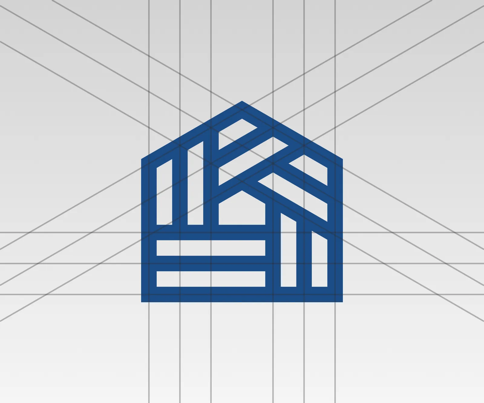
The mark is a gabled outline with the firm's initials built into its frame, drawn so the letters read as beams and floors rather than as letters placed inside a shape.
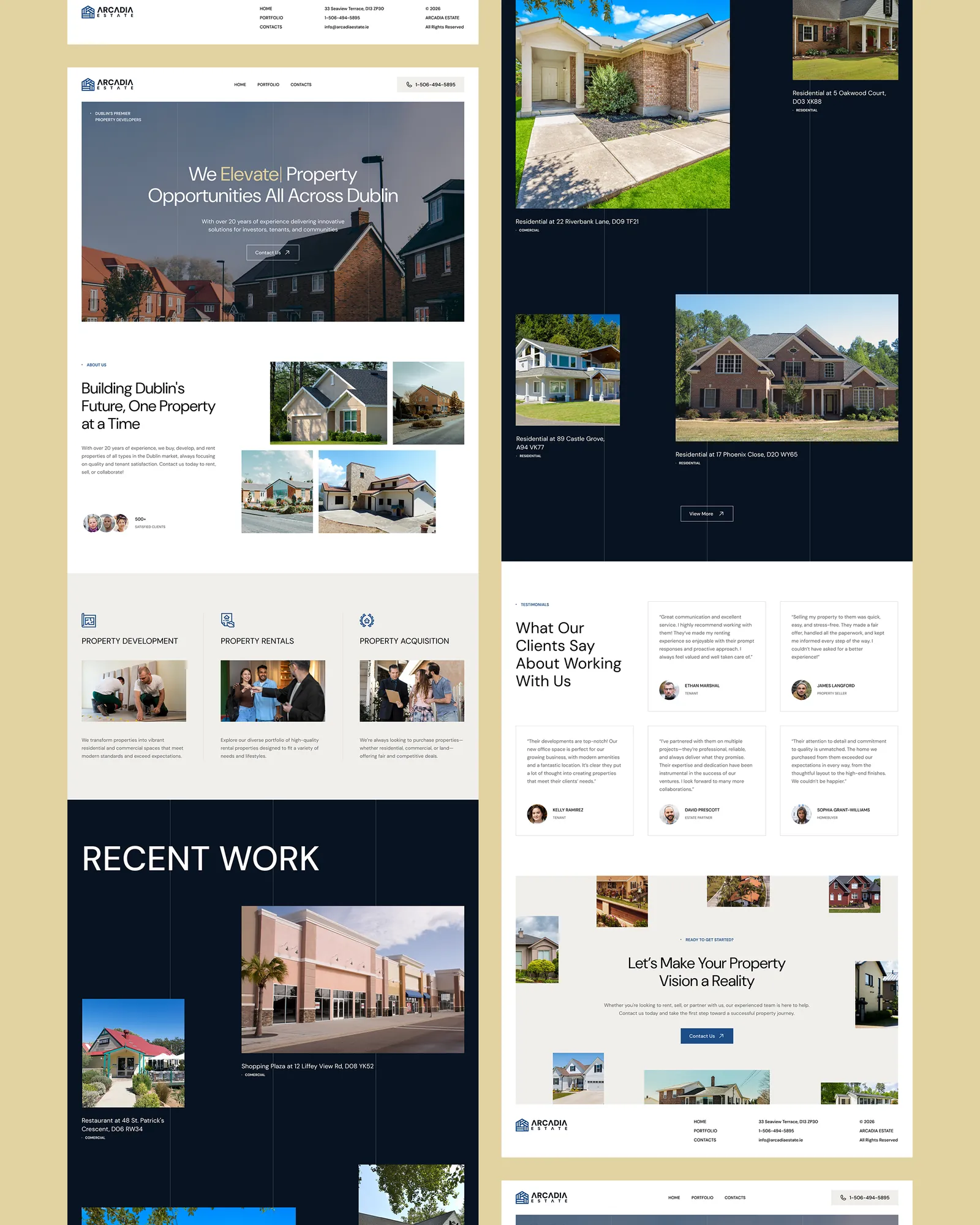
Navy and white, with a single warm gold that appears only where the eye should go. Property brands reach for gold to signal luxury and then use it everywhere. Here it lands on one word in the headline and nowhere else.
Properties hung on a line
The portfolio runs full-bleed in navy with thin vertical rules through the section and the properties hung off them at different heights and sizes. It borrows from a site plan rather than a listings grid, which gives a handful of properties more presence than a neat row of equal cards would.
The closing section inverts it. The message sits in the middle and the properties scatter around it, so the last thing you see is the work rather than the ask.